I just learned that last month the UN voted on a new map projection that actually positions countries at the correct size. It passed almost unanimously with one country voting against it. Not surprisingly, it was the US.


Apple System 7, Newton, and Apple Human Interface guidelines. UX Director at Symbian, manager Mobile UX at Google, creative director frog design San Francisco. Head of Product for two startups. Returned to Google to lead the Physical Web in Chrome and explore multiple UX research projects in Android. Left 2024, now advising part time.
mastodon.social: 2017-2022
Blog: https://jenson.org/about LinkedIn: https://www.linkedin.com/in/scottjenson/ Chat with me: https://jenson.org/go/meet
I just learned that last month the UN voted on a new map projection that actually positions countries at the correct size. It passed almost unanimously with one country voting against it. Not surprisingly, it was the US.
I'm late to the party but I just finished "The Information" by James Gleick. It's heady stuff but I was fascinated. Such an insightful book. I even found a tie in to #UX design.
Charles Bennett, and American physicist had a concept of "logical depth". It suggests that the value of a message lies in the effort put into its creation, which ultimately makes it easier for the user to understand and process without needing to decode complex information.
This fits UX perfectly.
Strongly recommend.

10/31/2026, 1 engagement
This "accidental animation" can appear fun but I'd argue it belongs in our #UX Toolkit as negative pattern. It highlights a fundamental tradeoff: visual vs cognitive design. The dropdown indicator makes it clear the date is clickable. But an entire list of them at the same time is visually more cluttered.
I have my personal opinion but it begs the question: How do we discuss this? The problem is we don't, it's all just opinion. I'd prioritize for cogitive clarity and make the arrows ALWAYS visible at the cost of visual simplicity. Apps like Whatsapp (pictured here) prioritize exactly the opposite.
Fairly trivial problem that highlights a more profound issue: How do we get more rigor and certainty in a field that is mostly driven by "well, I think it looks cool..."

A small part of me was interested in the small additions Apple made to touch input for the MacBook Pro (e.g. expanding the items in a menu more when you touch vs click to give you bigger targets).
But then I realized I just really didn't care because ultimately it didn't really matter. These are all frills on the same dress. Apple makes great hardware to be sure, both it's processors, displays, and laptops are not notch. But nothing has deeply changed in a long time. They are spending their energy merging iOS and MacOS, not fundamentally improving what either does.
I get it. Most people don't want anything to change, but the first rule of incumbents: maintain the status quo. If Apple has lost the will to make real improvements, I do hope we start seeing others start taking some risks.

There's a certain Dunning Kruger effect going on with AI. I've talked to other #UX designers and they find it liberating to be able to build prototypes no longer beholden to a programmer.
But that doesn't make them a good programmer, and it certainly doesn't erase the host of ethical and environmental issues behind this. I'm not saying "#LLMs are awesome."
What I'm trying to explain is WHY people are mistakenly thinking this is more powerful than it is in reality. This is where Dunning Kruger comes in: Person A being able to roughly do person B's job (poorly and without even knowing how bad they are) is at the very heart of why the #AI hype is so high.
10/29/2026, 2 engagements
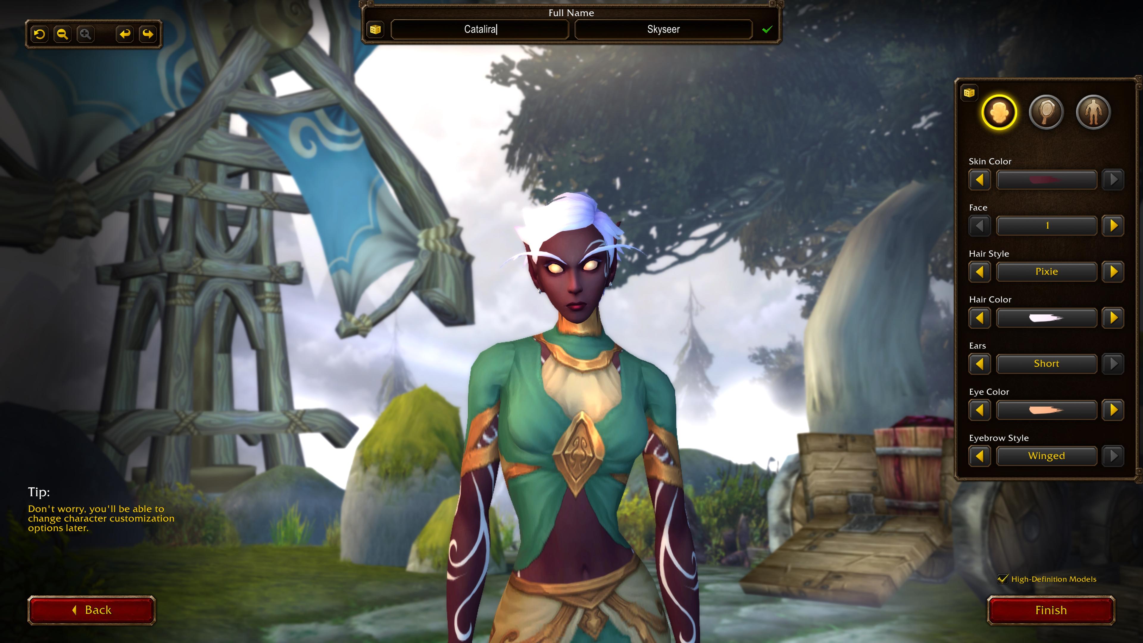
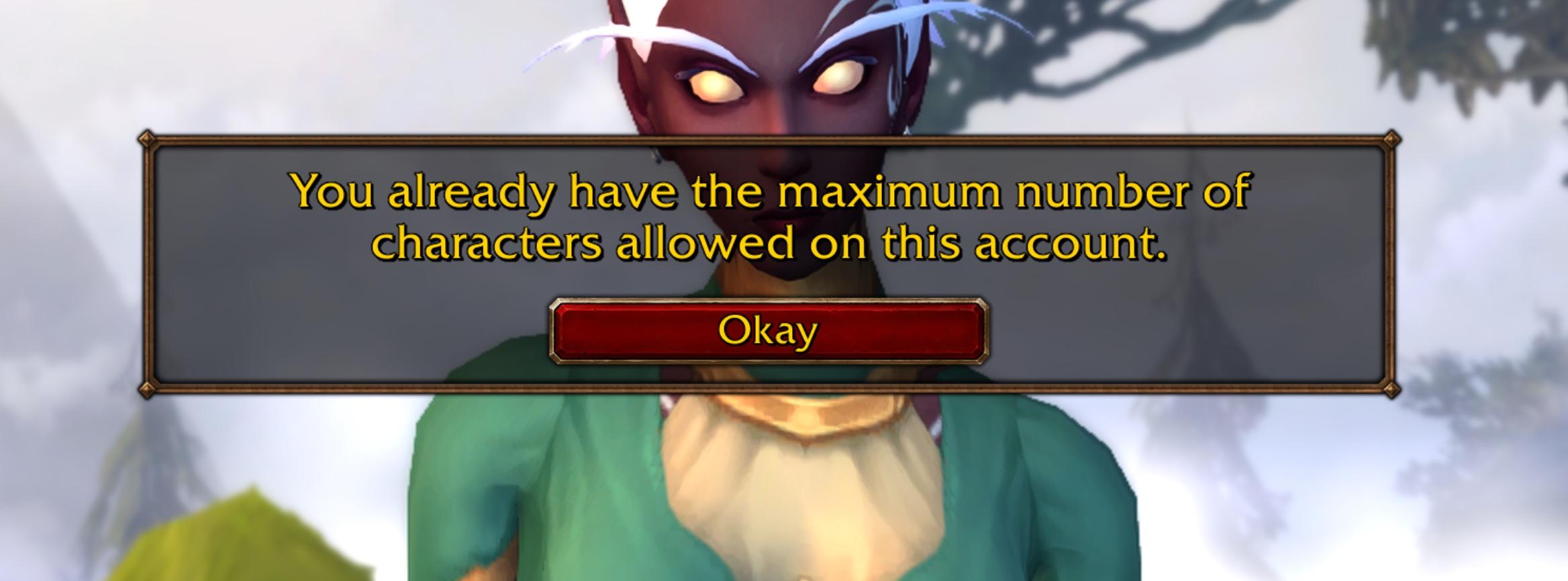
Some UX failures that are so easy to fix. This is a perfect example. In the new Wow Forever game, you are limited to three characters. But After you create three, you are somehow allowed to start a fourth.
But only when you get to the final final step and hit FINISH do you get the "no, sorry" error message. The same check could have been made at the very beginning of this flow rather than at the very end. And it would have saved so much frustration.
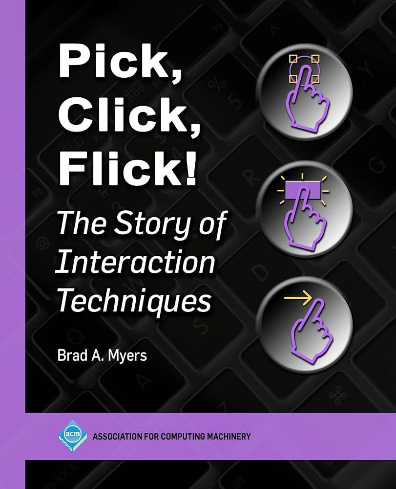
Brad Myers' Pick, Click, Flick is a historical reference of UX interaction, cataloging the evolution of UX over the decades. As a historical record of what has been built, the book is reasonably thorough.
While reading through it though, I found myself wanting more reflection from the author on why these changes occurred. (e.g. listing every scrollbar is helpful, but a deeper discussion of how they evolved, which ones succeeded, how mobile has turned scrolling on its head, all would have been fascinating) A raw catalog just begs so many "why?" questions. I was hoping Brad's historical perspective might impart more insight.
Ultimately, it is unfair to critique a book for what it never set out to be. Pick, Click, Flick is a historical index of what has gone before, and it succeeds at that goal. It's just whet my appetite for a follow up book that discusses what we've learned from that history (and what we've forgotten!) helping frame what we should be doing next.
I just had a LONG conversation with someone accusing me of all sorts of negative things, and what I found most toxic was their LACK of toxic language. They were calm, reasonable, and even polite.
But they used provocative language, subtlely criticising me and, of course, always asking for clarifications. This is the worst type of predator on Mastodon, the "polite troll" that hides behind civility but never wants to have a proper conversation, twisting words to get you angry.
They did me a great favor in the long run. It helped sharpen how I engage with disingenuous people that only want to waste your time. Thank you polite troll, for teaching me a lesson.
Classic advice for toxic behavior is "just block". Yes it does help. I've had to block about 10 accounts in the last month and honestly, things have drastically calmed down. It seems to prove that most of the toxic behavior is from a small minority.
But In doing user research, it was clear that many people self censor out of fear of toxic blowback.
The problem is that it's not just one block, you need to do it many times and each time you do it, your perception of the problem is reinforced. The trick is to get to the other side.
Many don't make it. That is my worry.
RE: https://social.coop/@scottjenson/117473614309131678
Some people seem to be thinking I'm taking credit for this design. Far from it. I had little to do with this redesign but I am proud of the team and what they've tried to do here. But change is hard and it takes time. Additional fixes and improvements will happen.
Thank you for all of the people that have taken time to give constructive and helpful feedback to the Mastodon team (which to be clear, has NOT hired me. I'm not a paid member of the team ;-)
Loading quoted post…
RE: https://mastodon.social/@Mastodon/117466983307949301
So much great work went into this, focusing not only and clarity but #accessibility. It was done only after talking to the community extensively. There are so many thoughtful details. Just poke around and you'll find them. Sure it's not fully complete yet (e.g. the right side is empty) but such a change a HUGE lift and a small team so they have to take it in waves.
But I love the new structure and look (and themes!)
10/20/2026, 1 engagement
RE: https://hachyderm.io/@mekkaokereke/117455880475309031
GIven the positive traction this post got, I'd like to collect some "benevolent algorithms" we could consider. For example:
"popular" is defined as some transparent metric around replies + boosts
The big loser in the "vibe coded Adobe apps" news isn't Adobe but Gimp. It is likely these apps won't be as good as Adobe but they do have a much cleaner UX so the occasional users that tried Gimp and gave up now have a much better alternative.
I don't care if it's expensive. I don't care if it's not practical.
This is just fun and joyous. We need more explorations like this.
9/24/2026, 3 engagements
I worked on the Android team for YEARS and I just learned that you can turn on "Clipboard History" on GBoard.
So many useful features are just too hard to find/setup.

My "Future of Desktop UX (part 2)" talk at #KDE Akademy is now up and it's racking up lots of views. I'm excited people want to discuss this more.
Now I just need someone with Wayland experience to help me prototype this.

I'm now using a local on-device voice to text transcriber on my computer and it really is revolutionizing how I input text. It allows me to write much longer passages than I would normally want to write by hand.
The downside is that I have to lock myself in my office because using it in the living room with my wife drives her crazy. #UX #Voice
here is my reply again
RE: https://oldbytes.space/@gloriouscow/117136432242182000
I think this can be said about many things, ESPECIALLY technology.
Loading quoted post…
RE: https://mastodon.social/@Mastodon/117117221397911074
This is just outstanding work, deeply rooted in talking to the community and solving pain points users are facing every day. This is such a great step forward.
Loading quoted post…